Instagram's iPad App Redesign Now Mirrors the iPhone Experience
The iPad version now looks and feels like its iPhone sibling, making navigation easier.

Instagram's iPad App Redesign Now Mirrors the iPhone Experience
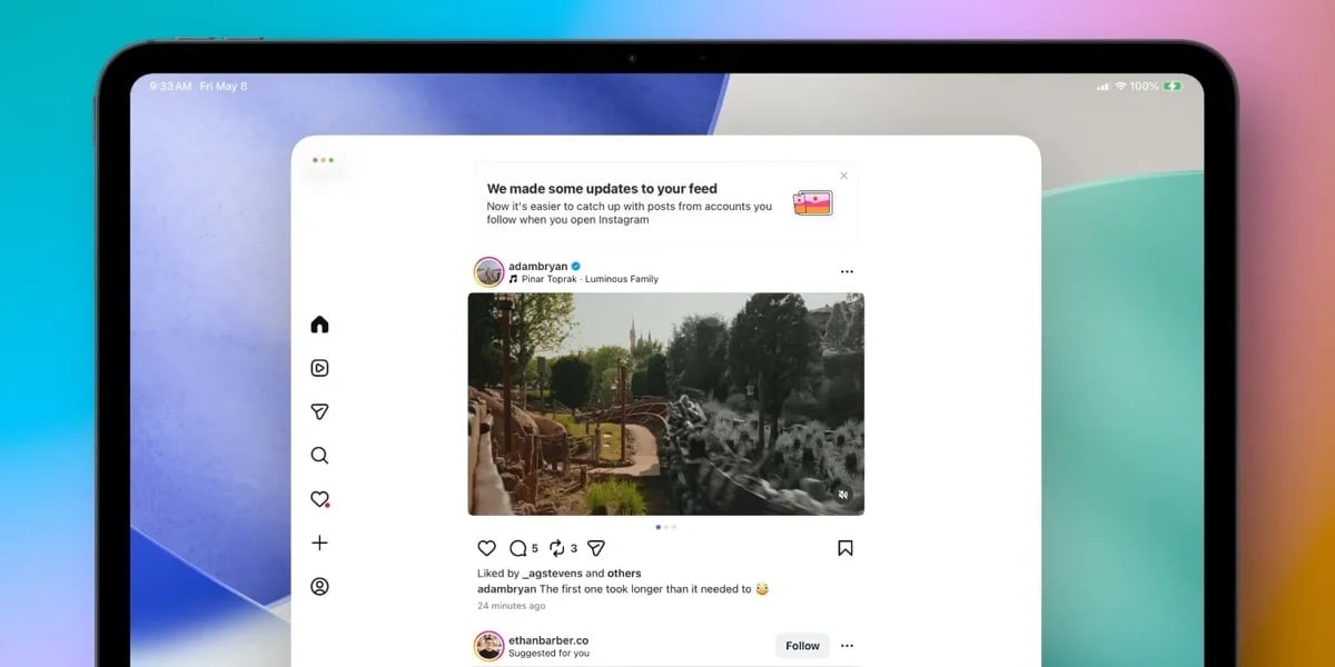
Instagram has given its iPad application a significant facelift, aligning it more closely with the user experience on iPhones. This strategic redesign aims not only to unify the platform's interface across devices but also to enhance user engagement by offering a consistent and familiar interaction model. The iPad app, which first saw its native launch in the fall of last year, now sheds its previous web-like interface in favor of one that mirrors the iPhone's design, thereby providing a seamless social media experience.
Context: The Evolution of Instagram on iPad
For years, iPad users faced a less-than-ideal experience when trying to use Instagram. Prior to launching a native app, users had to rely on the web interface or third-party applications that often fell short in terms of functionality and user experience. The introduction of the native iPad app last year marked a pivotal moment, finally addressing a long-standing gap in Instagram's device support. This redesign further consolidates Instagram's commitment to enhancing its user experience across different platforms. In a broader context, this move aligns with a growing industry trend where tech companies strive for consistency across devices, ensuring that users have a familiar experience whether they're on a smartphone, tablet, or desktop.
What's New in the Update?
The most noticeable change in the iPad app is the departure from a web-style interface with a sidebar that housed messages and comments. Instead, the app now features a home tab displaying a feed similar to that of the iPhone. The previous Reels-first setup has been replaced with a dedicated tab for Reels, much like on phones, which allows users to browse short videos without interrupting their main feed experience. This shift is designed to cater to users who favored the traditional Instagram feed, potentially increasing their engagement on the platform.
Additionally, the "Following" tab has been removed, a move that may affect how users interact with content on the app. This decision aligns with Instagram's broader strategy of streamlining its interface and focusing on features that drive user engagement. By making these changes, Instagram is not just mimicking the iPhone experience but is also aligning with user preferences that emphasize ease of navigation and content discovery.
How it Compares: iPhone vs. iPad
The redesign brings the iPad app closer in line with its iPhone counterpart than ever before. This alignment reflects a broader trend in app development where uniformity across devices is prioritized. By ensuring that the app looks and feels the same, Instagram is banking on reducing the learning curve for users who switch between devices. For many users, the familiarity of the design could enhance their overall experience, making them more likely to engage with the platform consistently.
However, while the visual and functional elements of the app are now more aligned, it's important to note the differences in how users interact with iPads versus iPhones. The larger screen of the iPad offers more real estate for content, which can enhance the viewing experience but also poses challenges in terms of navigation and interaction. As Instagram continues to refine its app, it will be interesting to see how it balances these aspects to cater to the unique attributes of the iPad.
What's Still Unclear
While the redesign brings significant improvements to the iPad app, several questions remain unanswered. One of the key uncertainties is whether Instagram plans to introduce features that are unique to the iPad, leveraging its larger display and processing capabilities. Such features could include enhanced photo editing tools or multitasking capabilities that take advantage of the iPad's strengths.
Additionally, the removal of the "Following" tab raises questions about user reactions and the potential impact on app usage patterns. Will users miss this feature, or will they adapt to the new design seamlessly? Moreover, Instagram's future update plans remain a mystery. Will there be additional changes that further distinguish the iPad app from its iPhone counterpart, or will the focus remain on maintaining design consistency?
What This Means for You
For iPad users, this redesign means a more intuitive and cohesive Instagram experience that mirrors what they're accustomed to on their iPhones. This could translate into increased usage as the app becomes easier to navigate and more enjoyable to use. Users who previously preferred the iPhone app for its smoother interface might now find the iPad version equally appealing, encouraging them to spend more time engaging with content on a larger screen.
Key Takeaways:
- The updated iPad app now mirrors the iPhone experience.
- The previous web-style interface has been replaced for a more unified look.
- Reels have a dedicated tab, and the "Following" tab is no longer available.
- The redesign aims to boost engagement by offering a familiar interface.
Editorial Take
Instagram's decision to redesign its iPad app to mirror the iPhone experience is both a strategic and user-focused move. By aligning the interface across devices, Instagram not only simplifies the user experience but also reinforces its brand consistency. While some users may miss certain features like the "Following" tab, the overall effect is likely to be positive, encouraging more prolonged engagement across devices. As Instagram continues to evolve, the key will be balancing consistency with innovation, ensuring that the app remains both familiar and fresh for its diverse user base. While there are still unanswered questions about future updates, this redesign signifies a positive step towards a more cohesive user experience across all platforms.
Editor-tracked discounts on the gadgets and gear worth buying right now.
See the deals →Discuss this story
Got a take, a correction, or a follow-up tip? Reply where you read — we read everything.
Found an error? File a correction at /corrections. Substantive corrections are logged publicly.
One short email. The most important Web & Apps news, fact-checked, no fluff. Free, unsubscribe anytime.
More from Web & Apps

D23 2026: Disney's Content Deluge Sparks Questions About Strategy
Byte-Pulse cuts through D23 hype: We dissect Disney's ambitious content slate, from Simpsons: Hit & Run to Ahsoka season 2, and question the real-world implications and European market strategy.

Spotify Relaunches AI Running Mode for iOS Premium Users
Spotify's new Running Mode for iOS uses AI to sync music with your stride, but its success hinges on AI quality and user input
WhatsApp Web Gets Calls: Meta's Cross-Platform Play Begins
WhatsApp Web now supports encrypted calls, screen sharing, and call transfers. We dissect Meta's strategic shift and its implications for users and enterprise adoption in Europe.

Fox's $22 Billion Acquisition of Roku: A New Era in Streaming
Fox's acquisition of Roku for $22 billion marks a pivotal shift in streaming, merging content strength with platform reach.
The Byte-Pulse Newsroom is the editorial system that produces Byte-Pulse's daily tech news coverage. Each story is cross-referenced across 3+ independent outlets, drafted with AI assistance by the newsroom system (Drafter → Editor → Fact-Checker → Polisher), and reviewed by Serhat Er, Editor-in-Chief, before publication. We disclose AI augmentation openly. Editorial accountability stays with the named editor on every article. Tips: editorial@byte-pulse.net.
Don’t miss these
Xiaomi 16 Pro vs iPhone 18 Pro: Which Flagship Fits Your World?
Deciding between the Xiaomi 16 Pro and iPhone 18 Pro? We break down every spec and trade-off, so you can make the choice that's right for you.
Proton VPN vs NordVPN: Which One Earns Your Subscription?
A deep dive into Proton VPN and NordVPN, comparing their privacy, performance, features, and value, helping you make an informed decision.
Perplexity Pro vs ChatGPT Plus: Which AI Assistant Fits Your Workflow?
This guide lays out the strengths and approaches of Perplexity Pro and ChatGPT Plus, helping you identify which AI assistant aligns with your specific needs.

Pokémon TCG Movie Signals Strategic Media Pivot for The Pokémon Company
A new Pokémon movie focused on the TCG is coming in 2027, marking a strategic pivot for the franchise as it navigates massive global fan engagement and logistical challenges.

Apple's AI Pivot: Vision Pro Content Cut, Siri Rebuilt Amid Layoffs
Apple's latest layoffs signal a strategic pivot, dialing back high-cost Vision Pro content while re-tooling Siri for the AI era. What's next for Apple?
Motorola Edge 60 Ultra vs OnePlus 13: Which Android Flagship Fits Your Priorities?
Motorola Edge 60 Ultra and OnePlus 13 both aim for top-tier Android. We cut through the marketing to reveal the true differences, helping you choose.